
Fast loading website design: Essential 2025 Guide
Why Fast Loading Website Design Is Your Business’s Secret Weapon
Fast loading website design is the difference between a visitor who becomes a customer and one who hits the back button before your page even loads. Here’s what you need to know:
- Optimize images using WebP or AVIF formats and compress them before uploading
- Minimize code by reducing CSS and JavaScript files and removing unused scripts
- Enable browser caching to store static files locally for repeat visitors
- Use a CDN (Content Delivery Network) to serve content from servers closer to your users
- Choose quality hosting with fast server response times under 200ms
- Implement lazy loading so images and videos load only when users scroll to them
- Prioritize mobile-first design to ensure fast performance on all devices
The stakes are high. Research shows that 40% of users abandon a website if it takes more than three seconds to load. A one-second delay can cause conversion rates to drop by 7%. For mobile users, the impact is even more severe—every extra second can slash conversions by up to 20%.
Your website is often the first impression you make. A loading spinner creates a bad one. Studies show 75% of consumers judge a company’s credibility on its website design, forming an opinion in just 5.59 seconds.
Speed also impacts your SEO. Google uses page speed as a ranking factor, so slow sites struggle in search results. With two-thirds of internet traffic coming from mobile, your site must be fast on every device.
I’m Christian Daniel, and over the past 20 years building websites for hospitality, dining, and creative businesses, I’ve learned that fast loading website design isn’t optional—it’s the foundation of every successful site I deliver. I’ve seen how optimizing load times transforms bounce rates, conversions, and ultimately, revenue for my clients.

Similar topics to Fast loading website design:
Why Speed Is Your Most Valuable Digital Asset
Speed isn’t just a nice-to-have feature; it’s the foundation of your online success. Over my 20 years designing websites for hospitality and creative businesses, I’ve watched fast loading website design transform struggling sites into conversion machines.
I’ll start with user experience. A slow website is frustrating. I tell my clients it’s like making customers wait in line for no reason—they’ll just leave. The three-second window before users abandon your site is real and costs businesses money daily.
SEO rankings are where speed is critical. Google is clear: page speed is a ranking factor. A slow site tells Google you don’t care about user experience, letting faster competitors outrank you. This is devastating for a small business. If your site is slow, potential customers in Brooklyn or Queens might never find you.
The impact on conversion rates is where speed hits your bottom line. I’veseen it with my clients: a one-second delay in page load time causes conversion rates to drop by 7%. For mobile users, who make up two-thirds of all internet traffic, the stakes are even higher. A one-second delay can slash mobile conversions by 20%. When I’m working on a Conversion Focused Web Design, speed optimization is always the first priority.
Finally, consider brand credibility. Your site’s speed sends a message. An instant load time says you’re professional and modern. A slow site suggests you’re outdated. I’ve seen businesses in Hoboken and Jersey City boost customer trust just by improving their load times. In those first few seconds, speed is your brand.
Bounce rates and mobile user abandonment are directly tied to how fast your pages load. When someone taps your site on their phone, they expect it to appear instantly. If it doesn’t, they’re gone. That’s why I build every site with speed as a core design principle, not an afterthought.
Measuring What Matters: Diagnosing Your Website’s Speed
Before you can fix a slow website, you need to understand exactly what’s causing the sluggishness. Think of it like taking your car to a mechanic—you wouldn’t just say “make it faster” without first diagnosing the problem. The same principle applies to your website’s performance.
Over my 20 years of building sites, I’ve learned that the most important metrics to track are Google’s Core Web Vitals. These aren’t just arbitrary numbers—they’re user-centric measurements that reflect real-world experiences and directly influence your search rankings.
Largest Contentful Paint (LCP) measures how long it takes for the largest visible element on your page—usually a hero image or a major text block—to fully load. You’re aiming for under 2.5 seconds here. When I audit a client’s site and see an LCP over 4 seconds, I know I’ve got work to do.
First Input Delay (FID) tracks the responsiveness of your site. It measures the time between when someone first clicks a button or taps a link and when your site actually responds. A good FID is under 100 milliseconds. Anything longer, and users start feeling like they’re clicking on a frozen screen.
Cumulative Layout Shift (CLS) is my personal favorite because it addresses one of the most frustrating user experiences: when you’re about to click something and the entire page suddenly jumps, making you tap the wrong thing. I’ve lost count of how many times I’ve accidentally clicked an ad because of poor CLS. You want a score below 0.1 to keep your layout stable and your users happy.
Another critical metric I always check is Time to First Byte (TTFB). This measures how quickly your server responds after receiving a request. A slow TTFB—anything over 200ms—usually signals server-side problems or a subpar hosting provider. I’ve seen businesses transform their site speed simply by switching to better hosting.

To diagnose your fast loading website design issues, I rely on a handful of essential testing tools that give me the complete picture:
- Google PageSpeed Insights integrates Google Lighthouse overview and provides detailed scores for both mobile and desktop performance, along with specific recommendations for improvement
- GTmetrix offers waterfall charts that visualize exactly how each resource loads on your page, making it easy to spot bottlenecks
- Pingdom delivers straightforward insights into page load time, size, and request counts with an interface that’s easy to understand at a glance
I typically run tests from multiple locations—New York, Los Angeles, London—to see how your site performs for users in different geographic areas. This is especially important if you’re serving customers beyond your local market.
The beauty of these tools is that they don’t just give you numbers—they tell you stories. When I see a 5-second LCP, I know immediately to check image optimization. A poor FID usually points to JavaScript issues. High CLS often means images are loading without defined dimensions.
By regularly monitoring these metrics, I can pinpoint exactly what’s holding your site back and apply the right fixes to create a truly fast, responsive experience for your users.
My Blueprint for a Fast Loading Website Design
Achieving a fast loading website design isn’t about one magic solution. It’s about combining proven strategies across your site, from images to infrastructure. After two decades of building websites for restaurants, hotels, and creative businesses, I’ve developed a systematic approach that delivers fast, reliable results.
Let me walk you through how I optimize every site I build.
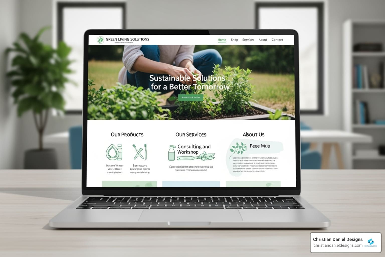
Optimizing Images and Media for a Fast Loading Website Design
Images and videos are vital but are also common performance killers. I’ve seen oversized photo galleries cripple gorgeous sites. My philosophy is simple: don’t use unnecessarily large files when better options exist.
Image compression is my starting point. You have two main approaches: lossy compression (like JPEG), which removes some data to reduce file size, and lossless compression (like PNG), which shrinks the file without discarding information. The key is balancing quality and speed.
Next-gen formats like WebP and AVIF offer far better compression than JPEGs and PNGs. I’ve seen a WebP image be less than half the size of a compressed JPEG with almost no visual difference. This optimization is a game-changer for speed.

Before uploading, I always resize images to their actual display dimensions. Serving a 4000px image for an 800px space is pointless and slows down your site.
Lazy loading is another game-changer. It defers loading off-screen images and videos until the user scrolls to them. This prioritizes visible content, resulting in a much faster initial page load.
For logos and icons, I rely on SVGs (Scalable Vector Graphics). They’re resolution-independent, look crisp on any screen, and have tiny file sizes.
Video optimization is crucial. Hosting videos directly on your server is almost always a mistake. Instead, I embed them from platforms like YouTube or Vimeo. These services are built for efficient streaming and take the load off your server, preventing a slow, buffering nightmare.
Streamlining Code and Reducing HTTP Requests
Every file on your site—images, CSS, JavaScript—requires an HTTP request. The more requests, the longer the load time. My goal is to minimize these requests and optimize the code itself.
Minification removes unnecessary characters from code files (white spaces, comments) without changing their function, often reducing size by 20-30%. I apply this to both CSS and JavaScript files.
Where possible, I also use concatenation, combining multiple CSS or JavaScript files into one to reduce HTTP requests.
One of the biggest performance killers is render-blocking resources, which prevent content from displaying until they’re processed. I identify these and either inline critical CSS or use asynchronous and deferred loading for non-essential JavaScript. The async and defer attributes ensure users see content quickly while other resources load in the background.
For small icons, I sometimes create CSS sprites—a single image file with multiple icons. This reduces requests, as the browser downloads one sprite instead of many individual icons.
I’m also ruthless about reducing third-party scripts. Analytics, social media widgets, and ad networks can drag down performance. I carefully evaluate each one, ensuring only essential, efficiently loaded scripts make the cut. Google offers resources to Learn about Web Performance, and I’ve detailed my site structure approach in my Custom Website Design Ultimate Guide.
Leveraging Infrastructure: Hosting, Caching, and CDNs
Even with optimized code and media, your site’s speed depends on its infrastructure. Think of it as the engine powering your fast loading website design.
Server response time is how long your server takes to respond to a request. An ideal time is under 200ms. A slow server makes all other optimizations less effective.
This is why choosing a quality hosting provider is non-negotiable. Cheap shared hosting is like a crowded hostel where one person’s party slows everyone down. I recommend providers like Kinsta, Cloudways, and Rocket.net for their speed and robust infrastructure.
Browser caching is another powerful tool. It allows a user’s browser to store static files (images, CSS) locally. On repeat visits, these elements load instantly from the local cache instead of being re-downloaded, dramatically speeding up the experience.
Content Delivery Networks (CDNs) take this concept global. A CDN is a network of servers distributed worldwide. It delivers content from the server closest to the user, significantly reducing latency. If your server is in New York City, a user in London gets content from a European server. Cloudflare is a popular CDN that offers substantial benefits, even on its free plan.
The Role of Mobile-First in Fast Loading Website Design
With mobile phones accounting for two-thirds of internet traffic, designing for small screens first is essential. A mobile-first approach naturally leads to a fast loading website design by forcing you to prioritize what matters.
Google’s Mobile First Indexing means the search engine primarily uses your mobile site for ranking. A slow or poorly optimized mobile site directly hurts your overall search visibility.
Designing for mobile first forces you to be ruthless with content. Limited screen real estate means focusing on essential elements, resulting in less clutter and a faster experience for everyone.
Simpler layouts emerge from mobile-first thinking, reducing the complexity of CSS and JavaScript needed to render the page.
My designs are always Responsive Website Design, adapting fluidly to any screen size. I also implement adaptive images, serving different image sizes based on the user’s device. A large desktop image automatically becomes a smaller, optimized version for mobile.
Most importantly, a mobile-first site performs better on slower mobile connections, ensuring even users with limited bandwidth can access your content quickly. Embracing Mobile First Indexing isn’t optional—it’s a fundamental requirement.
The Designer’s Dilemma: Balancing Visual Appeal and Velocity
This is where my two decades as a New York City web designer come into play. The challenge is creating a visually captivating website that still loads instantly. It’s a trade-off, and finding the right balance is more art than science.
When clients ask why a site isn’t “prettier,” my answer is simple: “Because it’s designed to work.” I once worked with a church whose beautiful, photo-heavy site had a 90% bounce rate. After I stripped away most photos and JavaScript, their bounce rate dropped to 40%, and retained traffic doubled. Visitors valued speed over aesthetics.
This experience reinforced my belief in minimalist design principles, which prioritize simplicity and function. A minimalist site is naturally lighter and faster by reducing elements to only what’s essential. Think clean typography, limited color palettes, and generous white space. This approach doesn’t just make your site faster; it helps focus your visitor’s attention.
I’m a strong advocate for lightweight UI components in every fast loading website design I create. This means using system fonts or carefully chosen web fonts with font-display: swap to prevent invisible text during loading. It means limiting excessive animations and using CSS-based transitions rather than JavaScript-heavy ones that bog down performance.
The trade-offs are real, and I’m always transparent about them. A stunning video background might kill your mobile performance. A complex animation might wow some visitors, but if it delays critical content, you’ve lost more than you’ve gained. My job is to help you prioritize function over flair. While I love creating Immersive Website Experiences, I always build them on a foundation of speed.
The key to finding that sweet spot is user-centric design. I always start by asking: What does your user truly need? By answering this, I can help you create a site where visual appeal and velocity coexist harmoniously. It’s about designing something that not only looks good but performs flawlessly, building brand credibility and keeping people coming back.
Frequently Asked Questions about Website Speed
Over the past 20 years building websites for businesses in New York City and beyond, I’ve heard the same questions about website speed come up again and again. Let me share answers to the most common ones.
How fast should my website load?
When clients ask me this, I tell them to aim for an overall page load time under 3 seconds, with an ideal target of under 2 seconds. That’s the sweet spot where users stay engaged and conversions happen.
For Google’s Core Web Vitals specifically, you should target an LCP (Largest Contentful Paint) of under 2.5 seconds, an FID (First Input Delay) of under 100 milliseconds, and a CLS (Cumulative Layout Shift) of below 0.1. These aren’t just arbitrary numbers – they represent the threshold where users perceive your site as fast and responsive.
The faster you can go, the better. Every millisecond counts when it comes to keeping visitors on your site and turning them into customers. These benchmarks provide a solid foundation for achieving a truly fast loading website design.
Can too many plugins slow down my WordPress site?
Yes, absolutely. I see this all the time, especially with WordPress sites that have accumulated plugins over the years. It’s like collecting apps on your phone – eventually, the whole thing starts to lag.
Here’s what happens: each plugin adds its own code, scripts, and styles to your website. Even if you’re not actively using a plugin on a particular page, it might still be loading resources in the background. Poorly coded plugins are even worse, consuming server resources and adding unnecessary JavaScript and CSS that bog down your site.
The solution? I recommend a regular plugin audit. Keep only the well-coded, essential plugins that serve a clear purpose. If you haven’t used a plugin in months, deactivate and delete it. I’ve seen WordPress sites cut their load time in half just by removing unnecessary plugins. It’s crucial to be ruthless here – your site’s speed depends on it.
Is a CDN necessary for a small local business website?
This is a great question, and my answer might surprise you. While a CDN isn’t strictly necessary for a small local business in the same way it is for a global enterprise, it can still offer significant speed benefits that are absolutely worth considering.
Even if your customers are primarily in Queens or Hoboken, a CDN can serve your static assets – images, CSS files, JavaScript – from a nearby edge server faster than your main hosting server can. This is especially noticeable during peak traffic times or when multiple users are accessing your site simultaneously.
The beautiful part? Many CDN providers, like Cloudflare, offer generous free plans that can provide substantial performance improvements without any additional cost. A CDN helps offload requests from your main server, reducing the burden on your hosting and providing a snappier experience for your local customers. In my experience, even small businesses see measurable improvements in load times and user satisfaction after implementing a CDN.
Conclusion
I hope this guide has shown you that fast loading website design is the foundation of everything your website needs to accomplish. Speed isn’t something you add on at the end—it’s woven into every decision, from the images you choose to the hosting provider you select.
Throughout my 20 years building websites for restaurants, hotels, and creative businesses across New York City, I’ve watched as speed transforms outcomes. A site that loads in under two seconds doesn’t just rank better in Google—it earns trust the moment someone clicks through. It respects your visitor’s time, whether they’re browsing from a coffee shop in Brooklyn on spotty WiFi or comparing your menu to a competitor’s on their lunch break.
By implementing the strategies I’ve outlined—optimizing your images, minifying code, leveraging a quality CDN, and embracing mobile-first design—you’re building something that works as hard as you do. You’re creating an experience that converts browsers into buyers, that keeps bounce rates low and engagement high.
This isn’t just about pleasing an algorithm. It’s about your bottom line. When your site loads fast, people stick around. They explore your services. They fill out contact forms. They make reservations. They buy.
If you’re ready to build a site that’s as fast as it is beautiful, one that actually drives results for your business, I’d love to help. Explore my NYC Squarespace Designer Guide to see how I approach web design with speed, conversions, and your unique needs at the center of everything. I’m excited to create something exceptional with you.