Why Mobile-First Indexing Is Critical for Your Business
Mobile-first indexing means Google primarily uses the mobile version of your website for indexing and ranking. Here’s what you need to know:
Quick Overview:
- What it is: Google crawls and indexes your mobile site first, not your desktop site.
- When it started: November 2016 (fully completed by October 2023).
- Why it matters: Over 59% of global web traffic comes from mobile devices.
- Key impact: Your mobile site’s quality directly affects your search rankings.
- Main requirement: Your mobile and desktop sites must have the same content (content parity).
This is a fundamental shift in how Google evaluates websites. Previously, Google crawled desktop versions. Now, if your mobile site lacks content that exists on your desktop site, Google won’t see it—and won’t rank you for it.
The stakes are high. With over half of all internet traffic coming from mobile devices, Google made this change to reflect user behavior. If your site performs poorly on mobile, you’re not just frustrating customers—you’re actively hurting your search visibility.
I’m Christian Daniel, founder of Christian Daniel Designs. For over two decades, I’ve helped hospitality and creative businesses adapt to changes like mobile-first indexing through custom web design and strategic optimization. Understanding this shift is critical for any business that needs to be found online.

What is Mobile-First Indexing and Why Does It Matter?
Previously, most people browsed the internet on a desktop computer, so Google indexed the desktop version of websites. But today, with nearly 60% of all web traffic coming from mobile devices, how people access information has completely flipped.
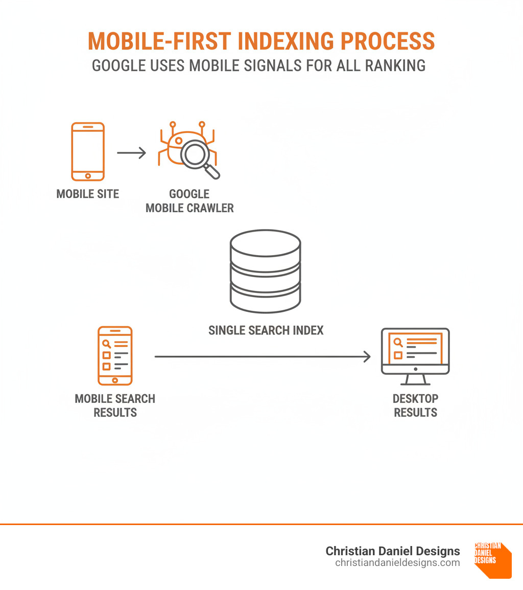
Mobile-first indexing is Google’s response to this new reality. Instead of looking at your desktop site, Google now uses the mobile version of your website as its main source for understanding and ranking your content. The smartphone version of your site is what Google sees first.
This is significant because Google maintains a single index for all searches, now built primarily from mobile sites. If your mobile site is missing content that exists on your desktop version, Google won’t see it. And if Google doesn’t see it, you won’t rank for it—on any device.
Ranking signals—like content quality, page speed, and user interaction—are now derived from your mobile experience. A weak mobile site doesn’t just hurt your mobile rankings; it harms your visibility across the board, even for desktop users.
Let’s look at how things changed:
| Feature | Desktop-First Indexing | Mobile-First Indexing |
|---|---|---|
| Primary Crawler | Desktop Googlebot | Smartphone Googlebot |
| Content Source | Desktop version of the website | Mobile version of the website |
| Ranking Signals | Primarily derived from desktop content | Primarily derived from mobile content |
| Index Type | Single index, built from desktop content | Single index, built from mobile content |
| Impact | Mobile experience was a separate factor | Mobile experience is the foundation |
The Shift to Prioritizing Mobile
The numbers are clear: Statista reports that mobile internet usage now accounts for 59.45% of all web traffic globally. This isn’t a trend; it’s the new normal. People search for businesses on their phones while walking down the street, sitting on the subway, or from their couch.
Google announced this shift in 2016, recognizing that most users were already searching from mobile devices. The company’s motivation was simple: if most people use phones to search, the results should reflect the experience those users will have.
Imagine searching for a restaurant on your phone and landing on a site that’s impossible to steer on a small screen. That’s the problem Google wanted to solve. By prioritizing the mobile version for indexing, Google ensures that what it ranks is what most users will actually experience. This focus on mobile is about user experience and search relevance, aligning the search engine with how people use the internet today.
Key Benefits of Optimizing for Mobile
Getting your mobile experience right isn’t just about avoiding problems; it drives real business growth.
Your search rankings improve. When your mobile site is fast, clear, and easy to steer, Google sees a site that deserves to rank higher.
Better user engagement follows. Visitors who find what they need without frustration stay longer and explore more. This engagement signals value to Google, further boosting your rank.
Bounce rates drop with a smooth mobile experience. Slow or clunky sites make users leave instantly. A well-optimized site keeps them there, sending positive signals to Google and increasing conversions.
You’re also future-proofing your website. Mobile usage will only grow, and by embracing mobile-first principles now, you’re building a foundation that will serve you for years to come.
Most importantly, you gain a competitive advantage. In markets like New York City, Queens, Jersey City, and Hoboken, many businesses still lag in mobile optimization. When you get this right, you capture the customers they’re losing.
The Core Principles of Google’s Mobile-First Indexing
Getting mobile-first indexing right means understanding that Google now evaluates your site through the lens of a mobile user. The core principles revolve around giving users a consistent, fast, and intuitive experience on any device.

Content Parity: Your Mobile and Desktop Sites Must Match
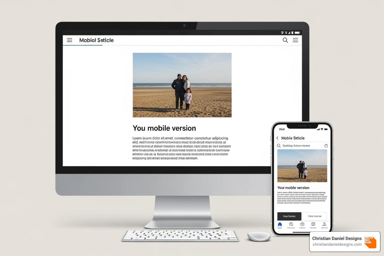
Many businesses trip up by creating a “lite” mobile version of their site that’s missing key content. This is no longer acceptable. Content parity means everything important on your desktop site must also be on your mobile site.
Because Google primarily looks at your mobile version to rank you, if content doesn’t exist there, Google pretends it doesn’t exist at all. This includes all text content, images (optimized for speed), videos, and your internal linking structure. Behind-the-scenes elements like metadata (title tags, meta descriptions) and structured data (schema markup) must also be consistent.
Good news: Hiding content in accordions or tabs for a cleaner mobile UX does not hurt your SEO. Google has clarified that content hidden for usability is given full weight, allowing for flexible design without sacrificing rankings.
For complete technical details, Google’s official guide on Mobile-First Indexing is the definitive resource.
Page Speed and Core Web Vitals
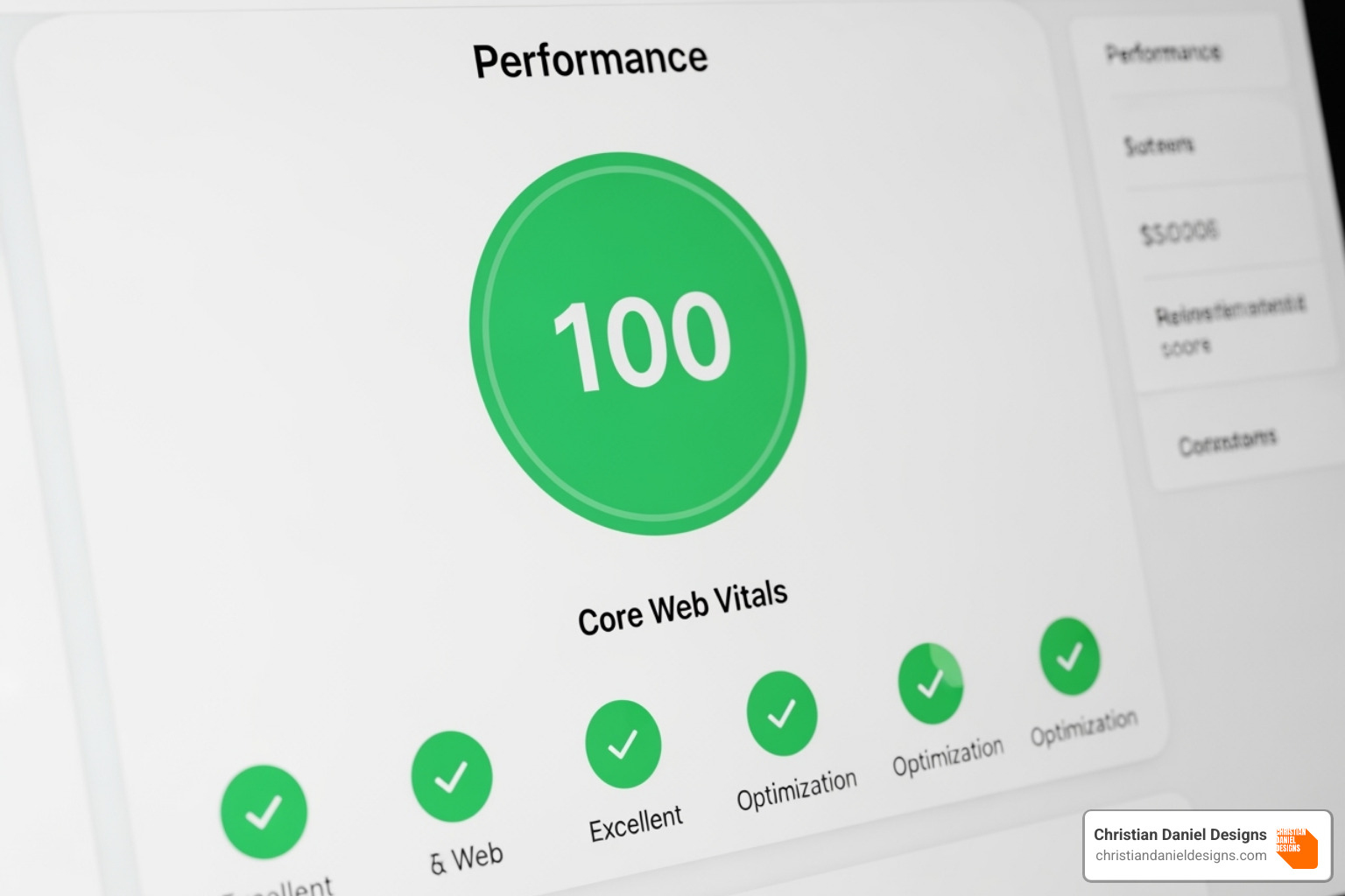
Speed is critical on mobile. With 83% of users expecting a load time of three seconds or less, every millisecond counts. Google measures your page experience through Core Web Vitals, a set of metrics essential for ranking.
- Largest Contentful Paint (LCP) measures how long it takes for your main content to appear. Aim for under 2.5 seconds.
- Interaction to Next Paint (INP) measures how responsive your site feels when a user interacts with it.
- Cumulative Layout Shift (CLS) measures visual stability, penalizing pages that shift unexpectedly as they load.
To improve these metrics, start with image compression using modern formats like WebP. Also, use caching to store site data on a visitor’s device for faster return visits. You should also minimize your code (HTML, CSS, JavaScript) and implement lazy-loading for images and media so off-screen content loads only when needed.
Technical SEO and Crawlability
Your site is useless if Google can’t crawl it. Technical SEO ensures Googlebot can access and understand your content.
- Responsive Web Design is Google’s recommended approach. The site automatically adapts to any screen size using one URL and one codebase, simplifying everything. This is what we build at Christian Daniel Designs.
- Dynamic Serving uses one URL but sends different code to different devices. It’s more complex and prone to errors.
- Separate URLs (e.g.,
m.example.com) are outdated and discouraged by Google.
Regardless of your setup, your viewport meta tag (<meta name="viewport" content="width=device-width, initial-scale=1.0">) is essential. Your robots.txt file must not block critical resources like CSS and JavaScript, and all crawlable resources must be accessible. With responsive design, canonical tags remain simple, but they require careful setup for separate URLs.
Mobile UX and Design Elements
Good technicals get Google’s attention, but good UX keeps users engaged. A site that’s frustrating to use will fail.
We design thumb-friendly navigation with interactive elements in easy reach. Tap targets (buttons, links) must be large enough to tap easily—Google recommends at least 48×48 pixels with 8 pixels of space between them. Font readability is also crucial; we use a minimum of 16px for body text to ensure comfortable reading without zooming.
Adequate spacing improves comprehension and reduces cognitive load. Finally, avoid intrusive interstitials like full-screen pop-ups that block content, as Google penalizes these on mobile.
How to Test and Monitor Your Mobile Performance
Building a mobile-optimized site is just the start. The real work is in continuous testing, monitoring, and fine-tuning your performance. Luckily, Google provides excellent free tools to help.

Using Google’s Tools to Your Advantage
Google has built powerful tools to help you improve your mobile performance. These are essential for anyone serious about mobile-first indexing.
Google Search Console is your direct line to Google. Its URL Inspection Tool is invaluable for seeing how Google’s smartphone crawler views a specific page. You can check its indexed status, find coverage issues, and run live tests. The Mobile Usability Report acts as a health check, flagging issues like small fonts or close tap targets. The Core Web Vitals Report shows how your pages perform against LCP, INP, and CLS.
Google’s PageSpeed Insights tool analyzes your page and provides separate scores for mobile and desktop, along with actionable suggestions for improvement.
Google’s Mobile-Friendly Test is perfect for quick checks, giving you instant feedback on whether a page is mobile-friendly.
Understanding the impact of mobile-first indexing on your site
Once optimized, you need to interpret the data from these tools. Monitor your mobile usability reports weekly or monthly and fix any errors that appear. Tracking mobile versus desktop rankings can reveal important patterns and opportunities. Use the Coverage report in Search Console to find pages that Google is struggling to access.
When analyzing Core Web Vitals data, prioritize pages marked as “Poor” or “Needs Improvement.” Since these metrics are primarily from your mobile site, fixing them is critical.
The Consequences of Not Optimizing
Ignoring mobile optimization means excluding the majority of your potential audience. Google began the mobile-first indexing rollout in November 2016 and officially completed it in October 2023. The grace period is over.
If you haven’t optimized, the risk of poor rankings is severe. A slow or confusing mobile site is seen as a low-quality experience, which directly impacts your search visibility. For non-mobile-friendly sites, Google will use its legacy desktop crawler for now, but this is temporary. They will reduce desktop crawling over time, and eventually, these sites could become non-indexable and disappear from search results.
Beyond rankings, a negative user experience damages your brand. 57% of users won’t recommend a business with a poor mobile site. This all leads to a loss of traffic, fewer inquiries, and less revenue. The question isn’t whether to optimize, but how quickly you can get it done.
Frequently Asked Questions about Mobile-First Indexing
Mobile-first indexing can feel overwhelming, so let’s clear up some common questions I hear from clients.
What if my site doesn’t have a mobile version?
If your site isn’t mobile-friendly, Google will still try to index it using its smartphone crawler on your desktop version. This means Googlebot views your desktop site on a small screen, which can cause rendering issues. More importantly, it creates a frustrating experience for your actual mobile visitors.
While Google won’t completely ignore your site, you’ll almost certainly rank poorly against mobile-optimized competitors. We always recommend responsive design as the best path forward for both search performance and user experience.
Does content hidden in tabs or accordions get devalued on mobile?
No. This is a common misconception. Google has explicitly clarified that content hidden for a better mobile user experience receives full weight. This was a deliberate change with mobile-first indexing. As long as you’re using these elements to create a cleaner experience and not to deceive users, your SEO won’t suffer.
This is liberating for designers, as we can create rich mobile pages without clutter. You can confidently use accordions or tabs to organize content, and your users will have a better experience.
Is there a separate index for mobile and desktop?
No, Google maintains one single search index. Mobile-first indexing refers to how Google builds that single index. Google’s crawlers primarily examine your mobile version to decide what goes into the index and how it should rank.
This single index then serves results to everyone, regardless of their device. That’s why it’s so critical that your mobile site represents your business accurately and completely. What Google finds on your mobile version directly impacts your visibility across all devices.
Conclusion
When Google announced mobile-first indexing in 2016, we knew a big change was coming. With the rollout complete as of October 2023, that future is here. Mobile isn’t just important—it’s everything.
We’ve covered the fundamentals: what mobile-first indexing is, why it matters, and the core principles of content parity, page speed, technical SEO, and mobile UX. We also reviewed how to test your site and the consequences of not optimizing.
For businesses today—whether in Manhattan, Queens, Jersey City, or Hoboken—your mobile experience directly determines your online visibility. It affects if customers find you, stay on your site, and choose to do business with you. This isn’t just about algorithms; it’s about meeting customers on their phones.
In my 20+ years of web design, mobile-first indexing is one of the most fundamental shifts. Your mobile site is no longer secondary—it’s the primary way Google views your business.
At Christian Daniel Designs, we tackle this challenge by building custom websites designed from the ground up with mobile users in mind. Fast loading times, intuitive navigation, and beautiful design that works on every screen are the foundation of what we do.
If you’re feeling overwhelmed about where your site stands, you don’t have to figure it out alone.
Get a custom, mobile-first website design that puts your business ahead of the curve and turns your mobile visitors into loyal customers.


