Why Your Website Should Be Your Best Salesperson
Conversion focused web design is the strategic practice of building websites that guide visitors toward specific actions—like making a purchase, booking a service, or submitting a contact form—using proven design principles, user psychology, and technical optimization.
Key elements of conversion-focused design:
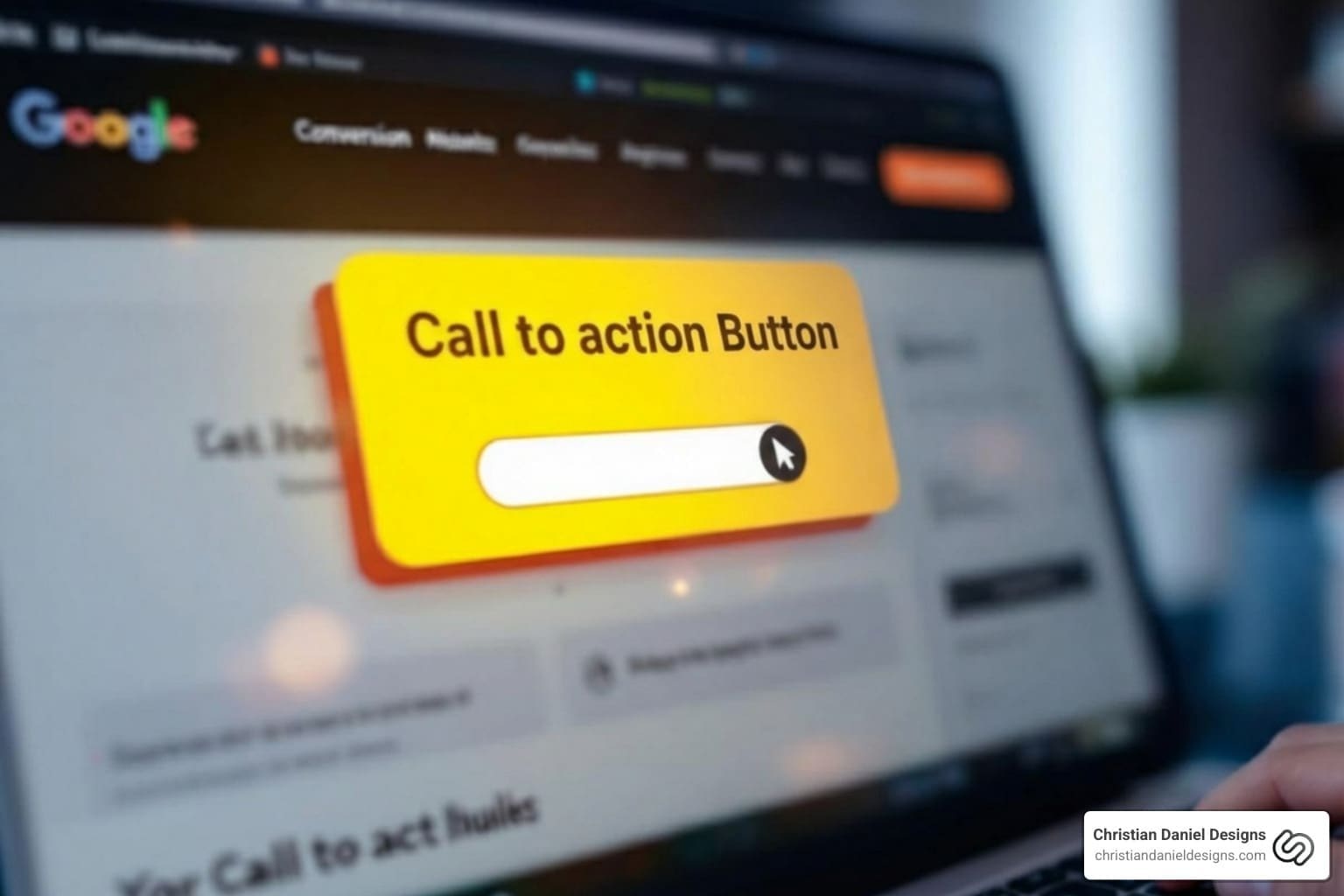
- Clear calls to action (CTAs) that stand out and tell users exactly what to do next
- Strategic layout and visual hierarchy that guides the eye to important elements
- Fast load times and mobile optimization to prevent visitors from bouncing
- Trust elements like testimonials, reviews, and security badges
- Minimal distractions with focused, clean design and effective white space
- Message matching between ads/search intent and landing page content
- User experience optimization through intuitive navigation and relevant content
Your website isn’t just your digital business card—it’s your best salesperson. But here’s the reality: most websites are built to look good, not to convert. A beautiful homepage won’t pay your bills if visitors land on your site and don’t know what to do next. That’s the difference between a website that just exists and one that actually drives bookings, generates leads, and increases revenue.
A conversion is any action a visitor takes that moves them closer to becoming a customer. For a restaurant, that might be making a reservation online. For a hotel, it’s booking a room. For a small business, it could be filling out a contact form or calling your phone number. Over half of all web traffic now comes from mobile devices, and users expect your site to load in three seconds or less. If your design doesn’t guide them toward that conversion quickly and clearly, they’ll click away—often forever.
The good news? Conversion-focused design isn’t about tricks or manipulation. It’s about understanding how people make decisions online and removing every barrier between them and the action you want them to take. It’s about psychology, clarity, and strategy working together. Research shows that consumers form an initial judgment about your brand within 90 seconds, and 62-90% of that judgment is based on color alone. Every element—from your hero image to your CTA button color to the testimonials you display—either helps or hurts your conversion rate.
I’m Christian Daniel, and through Christian Daniel Designs, I’ve helped hospitality brands like The Plaza Hotel and Park Hyatt Chicago build custom, conversion-focused web design strategies that turned six thousand dollars in ad spend into sixty-two thousand dollars in direct bookings. My approach is hands-on, data-driven, and built from scratch—no templates, just results. Let me show you how to turn your website into a revenue-generating machine.
 → Becomes customer. Key elements at each stage: fast load time and mobile optimization, trust signals and minimal distractions, prominent CTA with action-oriented copy, confirmation and follow-up. - Conversion focused web design infographic hierarchy")
What is Conversion-Focused Web Design?
At its core, conversion-focused web design is about creating digital experiences that gently yet effectively guide users toward a specific, desired action. It’s not just about making your website look pretty; it’s about making it work hard for your business. We leverage time-tested design principles, psychological triggers, and persuasion tactics to turn casual visitors into loyal customers. Think of it as designing with a clear purpose: every pixel, every word, and every button serves the ultimate goal of driving revenue and achieving your business objectives. It’s a strategic blend of user psychology, intuitive design, and data-driven decisions that moves us beyond mere aesthetics to quantifiable results.
We believe a truly effective website should be a lead-generating powerhouse. That’s why our custom website design process focuses intently on these conversion principles from the ground up. You can learn more about how we approach this with our in-depth resource: More info about custom website design.
Why It’s Crucial for Your Business
Why bother with a conversion-focused approach? Because your website is more than just an online brochure; it’s your most accessible and tireless salesperson, working 24/7. When designed for conversions, your website directly contributes to your bottom line, offering substantial benefits:
- Increased ROI: By optimizing your site, you maximize the value of every visitor. This means more leads, more sales, and a significantly higher return on your marketing investments, even without increasing your ad spend.
- Lead Generation: A well-designed site makes it easy for potential customers to find the information they need and take the next step, whether that’s filling out a contact form, signing up for a newsletter, or requesting a quote. It brings in aligned leads without constant hustle.
- Competitive Edge: In today’s crowded digital landscape, a superior user experience can set you apart. Businesses that prioritize their website’s ability to convert often outshine competitors who focus solely on aesthetics or outdated design.
- Building Credibility: A professional, intuitive, and efficient website instills confidence and builds trust with your audience. It shows that you value their time and understand their needs, enhancing your brand’s reputation.
- Maximizing Marketing Spend: When you drive traffic to your website (especially from paid ads), a conversion-focused design ensures that traffic doesn’t go to waste. Optimizing your site increases the chances that those visitors will become customers, giving you a higher ROI from your paid marketing campaigns.
A conversion-focused web design is about making your business more efficient and profitable. It empowers you to grow without burnout, creating ease by attracting and nurturing leads through clear, compelling online experiences. For a deeper dive into how this impacts business owners, explore A guide for business owners.
The Core Principles of Conversion Focused Web Design
To build a website that truly converts, we must go beyond superficial appeal and dig into the fundamental principles that influence user behavior. These principles form the backbone of any successful conversion-focused web design, ensuring that every element works harmoniously to guide your visitors toward their goals (and yours!).

At the heart of these principles is the idea of clarity over cleverness. While we appreciate innovative design, our priority is always to make your value proposition immediately understandable, create a consistent and intuitive user experience (UX), and establish a clear information hierarchy that directs attention where it matters most.
Principle 1: Create a Clear Visual Hierarchy
Imagine walking into a store where everything is screaming for your attention. Confusing, right? Your website shouldn’t feel that way. A clear visual hierarchy is about strategically arranging elements on a page so that the most important information stands out, guiding the user’s eye naturally towards your desired action.
We achieve this by understanding how people scan web pages. Eye-tracking studies reveal common patterns like the F-Pattern (users scan horizontally across the top, then down the left side, and then across again) and the Z-Pattern (users scan left-to-right across the top, then diagonally down to the left, and then left-to-right across the bottom). By placing key information and Calls to Action (CTAs) along these natural pathways, we ensure they are seen.
Furthermore, we prioritize elements by size, color, contrast, and placement. According to Fitt’s Law, the time required to move to a target area (like clicking a button) is a function of its distance and size. In simpler terms, the bigger and closer an object is, the easier it is to use. This means making important elements prominent and accessible. We also ensure that critical information and CTAs are placed “above the fold”—meaning they’re visible without scrolling—especially on initial landing pages, though we recognize that what’s “above the fold” varies by device. For more on this, check out Information on Fitt’s Law.
Principle 2: Maintain Focus and Eliminate Distractions
This principle is all about keeping your visitors on track. The more options or calls to action you present, the more likely visitors are to get confused or distracted. This phenomenon is known in psychology as overchoice or analysis paralysis—that familiar feeling of spending an hour scrolling through Netflix and still not picking a movie.
On a website, this means each page, especially a landing page, should ideally have a single, primary goal. We ruthlessly remove anything that doesn’t contribute to that goal. This might involve:
- Minimizing navigation: On critical landing pages, we might simplify or even remove global navigation menus to keep users focused on the offer.
- Reducing cognitive load: Too much information or too many clickable elements can overwhelm users. We break down content into digestible chunks and use clear, concise language.
- Leveraging white space: White space (or negative space) is your design’s best friend. It gives elements room to breathe, improves readability, and most importantly, draws attention to the elements that matter. A clean, uncluttered design helps your CTAs pop and makes it easy for visitors to know exactly where to look.
By focusing on a single, clear objective per page and stripping away unnecessary clutter, we make the user’s decision-making process effortless, leading to higher conversion rates.
Principle 3: Build Trust and Credibility
People buy from businesses they trust. In the digital field, where face-to-face interaction is absent, building this trust through design is paramount. We integrate various trust elements to reassure visitors and encourage them to take action.
- Social Proof: This is a powerful psychological phenomenon where people rely on the actions and feedback of others to determine what is right. We showcase this through:
- Testimonials: Authentic quotes from satisfied customers, ideally with high-resolution photos and full names, add a human touch and credibility.
- Reviews and Ratings: Displaying product or service ratings and reviews (like star ratings) provides immediate validation. We’ve seen businesses significantly increase revenue per visitor by simply enlarging review star sizes.
- Client Logos and Partnerships: Featuring logos of reputable clients or partners can instantly lift your brand’s perceived status.
- Data and Numbers: Highlighting impressive statistics, like the number of satisfied customers or years in business, can also build confidence.
- Trust Badges and Security Seals: For e-commerce sites, visible security badges (SSL certificates, payment processor logos) reassure customers that their information is safe.
- Professionalism and Consistency: A well-designed, functional website that loads quickly and is free of errors immediately conveys professionalism. Consistent branding across all pages (fonts, colors, tone) reinforces this image.
By thoughtfully incorporating these elements, we help visitors feel secure and confident in their decision to engage with your business. Learn more about how we build high-performance, trustworthy websites with Our process for building high-performance websites.
Strategic Implementation: Layout, Copy, and CTAs
Once we’ve established the core principles, it’s time to put them into action. This section focuses on the tangible elements that directly influence conversions: how we craft compelling calls to action, optimize your messaging, and leverage layout for maximum impact. It’s where the art of design meets the science of persuasion.

Every choice we make, from the words we use to the colors we choose, is aimed at creating a seamless and persuasive journey for your visitors. We consider message matching, apply frameworks like AIDA (Attention, Interest, Desire, Action), and use color psychology to make your website irresistible.
Crafting Compelling Calls to Action (CTAs)
Your Call to Action (CTA) is the gateway to conversion—it’s the explicit instruction for what you want your visitor to do next. A well-designed CTA is clear, compelling, and impossible to miss.
- Action-Oriented Language: We use strong, concise verbs that tell users exactly what will happen. Instead of “Submit,” think “Get My Free Quote” or “Book Your Table Now.” Microcopy can make a huge difference in encouraging clicks.
- Button Design: CTAs should visually stand out from the rest of the page.
- Color Contrast: We use contrasting colors that make the button pop. Research suggests that green can improve readability and is a great option for CTAs, but the key is to choose a color that isn’t used elsewhere for non-interactive elements, reserving one bold, eye-catching color strictly for your CTA.
- Placement: Prominent placement is crucial. We often place a primary CTA above the fold and repeat it at strategic points further down the page, especially after presenting key information.
- Size and Shape: Following Fitt’s Law, larger buttons are easier to click, especially on touch devices. We ensure CTAs are appropriately sized, often double the size of body copy fonts, and consider shapes that draw attention.
- Hover States: Subtle animations or color changes when a user hovers over a CTA can make it more enticing and confirm its interactivity.
We don’t just put a button on a page; we design it to be an irresistible invitation. For more tips on how to draw visitors in, see A guide to attracting visitors.
Optimizing Messaging and Copywriting
The words on your website are just as important as the visuals. Effective messaging and copywriting speak directly to your ideal client, addressing their needs, desires, and pain points, ultimately driving them to convert.
- Speaking to the Ideal Client: We craft copy that resonates with your target audience. A website that tries to speak to everyone often converts no one. We focus on their language, their challenges, and their aspirations.
- Highlighting Benefits, Not Just Features: People don’t buy products; they buy solutions to their problems or improvements to their lives. Instead of listing features, we focus on the benefits your product or service provides. “Get more bookings” is more compelling than “Advanced scheduling system.”
- Addressing Pain Points: Acknowledging the challenges your audience faces and positioning your offering as the solution creates an immediate connection and demonstrates empathy.
- Urgency and Scarcity: When appropriate and used ethically, creating a sense of urgency (“Limited-time offer!”) or scarcity (“Only 3 rooms left!”) can motivate immediate action.
- Message Matching: This is critical for a smooth user journey. Before someone lands on your website, an event (like an ad click or a Google search) triggers their visit. That pre-visit context shapes their expectations. We ensure that the messaging on your landing page perfectly aligns with what brought them there. If an ad promises “business plans in 15 minutes,” your landing page should explicitly confirm that promise in its hero section. This consistency builds trust and prevents confusion, significantly impacting conversion rates.
Leveraging Layout and Minimalistic Design
The way content is arranged and presented dramatically affects how users interact with your site. We advocate for layouts that are intuitive and minimalistic, reducing cognitive load and focusing attention.
- White Space: As mentioned, white space is invaluable. It provides visual breathing room, prevents your pages from looking cluttered, and makes your content easier to read. By isolating key elements with white space, we draw the user’s eye directly to them. Think of Google’s homepage—a vast expanse of white space focusing entirely on the search bar.
- Readability: Beyond white space, we optimize typography (font choice, size, line height, contrast) to ensure your text is easily legible. Clear headlines and subheadings break up content, making it scannable.
- Focusing Attention: A minimalistic design approach means stripping away anything that doesn’t serve a purpose. This simplifies the user interface, reduces visual noise, and ensures that the most important content and CTAs are the stars of the show. Apple’s website is a prime example of effective minimalistic design, using high-quality images and concise copy to highlight their products without distraction. See for yourself: Example of a clean design.
- Simplifying Forms: Forms are often conversion bottlenecks. We streamline them by asking only for essential information, using clear labels, and indicating progress for multi-step forms. The fewer clicks or fields a user has to complete, the higher the chance of conversion.
By embracing these layout and design principles, we create websites that are not only aesthetically pleasing but also highly functional and persuasive.
The Technical Foundation for High Conversions
Even the most brilliant design and compelling copy can fall flat without a robust technical foundation. In conversion-focused web design, speed and accessibility are non-negotiable. If your site isn’t fast and mobile-friendly, visitors won’t stick around long enough to appreciate your carefully crafted messages.
The Critical Role of Mobile Optimization
The mobile revolution is undeniable: over half of all web traffic comes from mobile devices. This isn’t just a trend; it’s the dominant way people interact with the internet. Therefore, designing for mobile is no longer an afterthought—it’s a priority.
- Responsive Design: We ensure your website adapts seamlessly to any screen size, from smartphones to tablets, providing an optimal viewing and interaction experience across all devices. This is crucial for user satisfaction and search engine ranking.
- Mobile User Experience: Mobile design requires a simplified approach. We focus on concise copy, larger tap targets, easy-to-use navigation (like hamburger menus or sticky navigation), and ensuring that key information is immediately visible without excessive scrolling.
- Simplified Navigation for Mobile: Cluttered menus are a mobile user’s nightmare. We streamline navigation to make it effortless for users to find what they’re looking for, even on a small screen.
- Click-to-Call Buttons: For businesses where phone calls are a primary conversion, easily accessible click-to-call buttons on mobile are essential.
If your site doesn’t perform flawlessly on a phone, you risk losing valuable leads before they even have a chance to engage with your content. Understanding The importance of mobile optimization is key.
Why Site Speed is a Conversion Killer
Patience is a virtue few internet users possess. Users expect a website to load in three seconds or less. If your site drags its feet, visitors are gone before you can say “conversion.”
- User Expectations: Slow load times lead to frustration and a high bounce rate. A slow website feels unprofessional and can erode trust, making visitors question your credibility.
- Bounce Rate: A slow-loading website is the number one reason visitors abandon a site. Every second counts; even a one-second delay can significantly impact conversions.
- Impact on SEO: Search engines like Google prioritize fast-loading, mobile-friendly websites. A slow site can negatively affect your search rankings, reducing organic traffic.
- Image Optimization: Large, unoptimized images are a common culprit for slow speeds. We ensure all images are compressed and properly sized without sacrificing quality.
- Caching and Clean Code: Implementing browser caching and ensuring clean, efficient code are technical steps we take to drastically improve your site’s loading speed.
Don’t let a sluggish site sabotage your conversion efforts. You can easily Check your website speed using tools like GTmetrix, which will even explain the issues causing slow speeds. To dive deeper into this topic, explore Learn about fast loading website design.
Frequently Asked Questions about Conversion Focused Web Design
We often encounter common questions from business owners looking to boost their online performance. Here are some of the most frequent inquiries about conversion-focused web design:
What is a good conversion rate?
This is one of the most common questions we hear, and the honest answer is: it depends! A “good” conversion rate varies significantly by industry, the type of conversion (e.g., a newsletter signup vs. a high-value purchase), and your business model. For example, an e-commerce site might consider 2-3% good, while a B2B lead generation site could aim for 5-10%.
Instead of chasing an arbitrary industry benchmark, we recommend focusing on two key metrics:
- Historical Data: Your best benchmark is your own past performance. Is your conversion rate improving over time?
- ROI as the Key Metric: A “good” conversion rate is one that delivers a positive return on investment for your business. If a 2% conversion rate generates significant profit, it’s good for you!
The goal isn’t just a higher number, but a higher profitable number. We aim for continuous improvement, always striving to optimize based on your unique business objectives.
How do I test my design changes?
Testing is the backbone of conversion-focused web design—it’s how we move from assumptions to data-driven certainty.
- A/B Testing: This is our go-to method. We create two versions of a page (A and B), changing only one variable (e.g., CTA button color, headline, image). We then show version A to half your audience and version B to the other half, measuring which version performs better in terms of conversions. This allows us to make incremental, impactful improvements.
- User Testing: Before a major launch or redesign, we conduct user testing with real people (or trusted colleagues) to gather qualitative feedback. Observing how users interact with your site, identifying points of confusion, and listening to their thoughts can uncover invaluable insights.
- Heatmaps and Session Recordings: Tools that generate heatmaps show where users click, scroll, and spend their time on a page. Session recordings allow us to watch anonymized user journeys, pinpointing exactly where they get stuck or abandon a process.
- Analytics Tools: Platforms like Google Analytics are essential for tracking conversion goals, understanding user flow, and monitoring key metrics over time.
By continuously testing and analyzing data, we make informed decisions that lead to tangible improvements in your conversion rates.
Can a beautiful website still convert well?
Absolutely! The idea that you have to choose between beauty and brains for your website is a myth. In fact, a visually appealing website can contribute to conversions by building trust and enhancing the user experience. However, the beauty must be strategic.
- Balancing Aesthetics and Usability: A stunning design that’s difficult to steer or understand will deter conversions. Our approach focuses on strategic beauty—design that is not only attractive but also intuitive, clear, and guides the user.
- Strategic Beauty: The aesthetics should serve a purpose. Colors, typography, imagery, and layout are chosen not just because they look good, but because they align with your brand, convey your message effectively, and direct attention to your conversion goals.
- Design Serving a Purpose: We believe that beautiful design, when executed with conversion principles in mind, is incredibly powerful. It improves credibility, makes your content more engaging, and improves the overall user journey, all of which contribute to higher conversion rates.
A website that looks good and works well is the ultimate goal for conversion-focused web design. We strive for designs that are both gorgeous and geared for generating revenue. To understand more about crafting a website that balances appeal with performance, explore our Our website designs ultimate guide.
Conclusion: Start Building Your High-Converting Website
In today’s competitive digital landscape, having a website that simply exists isn’t enough. To truly thrive, your online presence needs to be a powerful engine for growth, actively turning visitors into customers. Conversion-focused web design isn’t a luxury; it’s a necessity for any business looking to maximize its online potential.
We’ve explored how understanding user psychology, implementing clear visual hierarchies, eliminating distractions, building trust, crafting compelling CTAs, optimizing messaging, leveraging minimalistic design, and ensuring a robust technical foundation (especially mobile optimization and site speed) all contribute to a high-converting website. It’s a continuous journey of testing, refining, and adapting, but the rewards—increased ROI, more leads, and a stronger competitive edge—are well worth the effort.
At Christian Daniel Designs, we specialize in creating custom websites and scroll-stopping videos for hotels, restaurants, and small businesses in New York City. We don’t just build websites; we craft digital experiences designed to drive bookings and boost brand credibility, often with powerful WooCommerce functionality. Our award-winning approach combines cutting-edge design with a deep understanding of conversion principles, ensuring your website is not just beautiful, but brilliantly effective.
Don’t let your website be a missed opportunity. Take the first step towards changing your online presence into a revenue-generating machine.

