Color grading Premiere Pro: Master 2025 Edits!
Why Color Grading Premiere Pro Transforms Your Video Content
Color grading Premiere Pro is the process of stylizing your footage to create a specific mood and achieve a professional, cinematic look. If you’ve ever felt your footage looks flat or “shoddy,” you’re not alone. The secret to a rich, cinematic look isn’t expensive plugins—it’s understanding the right workflow.
Quick Answer: How to Color Grade in Premiere Pro
- Workspace: Switch to the Color workspace.
- Correction: Fix white balance, exposure, and contrast in the Basic Correction tab.
- Creative: Apply LUTs or manual adjustments in the Creative tab.
- Refinement: Fine-tune with RGB and Hue Saturation Curves.
- Consistency: Use Comparison View to match shots.
- Finishing: Add targeted adjustments with HSL Secondary and vignettes.
Color dramatically changes how an audience perceives a scene. Warm tones convey comfort, while cool blues create tension. For small businesses, professional color grading separates amateur videos from content that builds trust and drives bookings. Premiere Pro’s Lumetri Color panel provides all the tools you need, without exporting to other software.
I’m Christian Daniel, and with over two decades of experience editing for clients like The Plaza Hotel, I’ve mastered color grading Premiere Pro workflows. In this guide, I’ll show you how to transform your footage from flat to cinematic.
Color grading Premiere Pro word list:
The Foundation: Understanding Color Correction vs. Color Grading
Many editors jump straight to creative looks without fixing the basics, which leads to poor results. Think of it like building a house: you must build the foundation (color correction) before decorating (color grading).

Color Correction Defined: Fixing Technical Issues
Color correction is the essential first step of fixing technical problems to make footage look natural. This includes:
- White Balance: Ensuring whites look white, removing unnatural color casts (e.g., orange or blue tints).
- Exposure: Adjusting the overall brightness to avoid footage that is too dark or too bright (blown-out).
- Contrast: Managing the difference between bright and dark areas to prevent a flat or harsh look.
- Saturation: Controlling color intensity to appear natural, not overly vivid or dull.
Correction is a technical process that creates a clean, neutral starting point.
Color Grading Defined: Creating a Mood and Stylistic Choices
Once your footage is corrected, color grading is the artistic process of making creative decisions to tell your story. Pushing warm tones can make a restaurant feel inviting, while cool tones can give a corporate video a clean, trustworthy feel. The same footage can tell a completely different story based on its grade, changing the viewer’s emotional experience.
LOG Footage and F-log Explained
If you shoot in a LOG format like F-log, your footage will look flat, gray, and desaturated out of the camera. This is intentional. LOG is designed to capture the maximum amount of information, preserving details in highlights and shadows. This provides incredible flexibility for grading, but LOG footage must be converted to a standard viewable format using an Input LUT before you begin.
Why Correction Always Comes First
Color grading Premiere Pro workflows always start with correction. Applying a creative look to uncorrected footage bakes in technical problems like bad white balance or exposure, leading to unpredictable and poor results. The workflow is non-negotiable: correct first, then grade.
Reading the Signals: An Introduction to Lumetri Scopes
Your eyes can be easily fooled by your monitor or room lighting, which is why professionals rely on Lumetri Scopes. These tools provide an objective, mathematical representation of your video’s color and brightness.
- Waveform (Luma): Shows brightness levels. The bottom is pure black (0 IRE) and the top is pure white (100 IRE). A good signal is distributed evenly without being crushed at the bottom or clipped at the top.
- RGB Parade: Separates the image into Red, Green, and Blue channels. It’s essential for spotting and fixing color casts. For neutral objects, the three channels should be aligned.
- Vectorscope: A circular display showing hue and saturation. It includes a crucial skin tone line, which indicates the natural hue for human skin, regardless of ethnicity.
- Histogram: Shows the distribution of pixels across the brightness range.
Trust your scopes more than your eyes for consistent, professional results. For a deeper dive, check out this resource: Learn more about scopes.
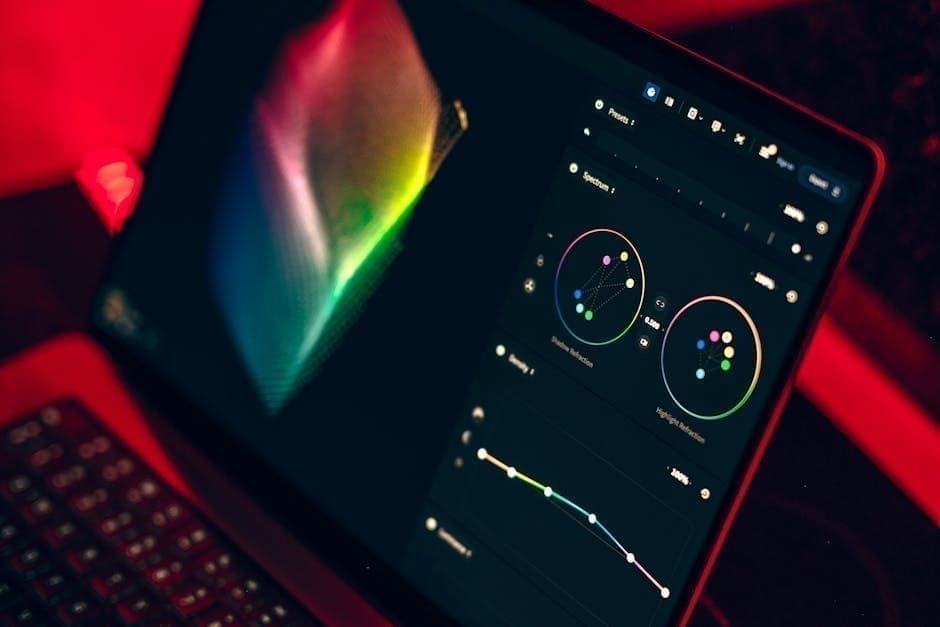
Your Command Center: Mastering the Lumetri Color Panel
The Lumetri Color panel is your mission control for color grading Premiere Pro. It’s organized into six sections that mirror a professional workflow: Basic Correction, Creative, Curves, Color Wheels & Match, HSL Secondary, and Vignette.

Basic Correction: The Starting Point for Every Grade
Every clip starts here. This tab is for fixing technical issues and creating a neutral base.
- Input LUT: Critical for LOG footage (like F-log). Apply a technical LUT here to convert the flat image into a standard Rec. 709 color space.
- White Balance: Use the eyedropper for a quick fix on a neutral gray or white area, then fine-tune with the Temperature (orange/blue) and Tint (green/magenta) sliders. Watch your RGB Parade scope for accuracy.
- Tone: These sliders control brightness and contrast. Exposure adjusts overall brightness. Contrast affects the difference between lights and darks. Highlights and Shadows target those specific ranges. Whites and Blacks set your absolute brightest and darkest points, and are great for recovering detail.
- Saturation: Adjust for natural, true-to-life color.
Creative Looks and Precise Adjustments with Curves
After correction, the Creative tab is your artistic playground.
- Look: Apply creative LUTs from this dropdown to give your footage a specific style. The Intensity slider lets you control the strength of the effect.
- Adjustments: Use Faded Film to lift blacks for a vintage feel, Sharpen to add crispness, and Vibrance to boost muted colors while protecting skin tones.
Curves offer surgical control over tone and color.
- RGB Curves: The go-to tool for contrast adjustments. Create a gentle S-curve to add punch to your image by pulling down shadows and raising highlights.
- Hue Saturation Curves: These allow for powerful, targeted adjustments. For example, use Hue vs Sat to increase the saturation of just the blues in a sky, or Hue vs Hue to shift a specific color.
For more on these tools, see Adobe’s guide to color wheels and curves.
HSL Secondary: Surgical Color Adjustments
HSL Secondary lets you isolate and adjust a specific color range without affecting the rest of the image. This is perfect for tasks like making a sky more vibrant, changing an object’s color, or perfecting skin tones.
The workflow is simple:
- Select: Use the eyedropper to pick a color in your frame.
- Refine: Use the H, S, and L sliders to fine-tune your selection, creating a precise mask (or “key”).
- Adjust: Use the color wheel and sliders at the bottom to change the hue, saturation, or lightness of only the selected area.
This level of control is a hallmark of professional grading, especially for ensuring skin tones remain natural and flattering.
A Cinematic Workflow for Color Grading Premiere Pro
To achieve professional results, follow a logical workflow. This process builds your grade in layers, ensuring each step supports the next.

First, find a hero shot—a key frame that represents the ideal look for your scene. This shot will be your reference for grading and matching everything else.
Next, adopt a non-destructive workflow using Adjustment Layers. Instead of applying effects to individual clips, place an Adjustment Layer above your footage on the timeline. Any Lumetri Color effect applied to this layer will affect all clips beneath it. This keeps your original footage untouched and makes it easy to toggle the grade on and off or apply different grades to specific scenes.
How to Color Grade F-log Footage for a Cinematic Look
F-log footage from cameras like the Fujifilm xT4 looks flat but contains immense color and dynamic range information.
- Apply a Technical LUT: In the Basic Correction tab, use the Input LUT dropdown to apply the correct F-log to Rec. 709 LUT. This is a technical conversion, not a creative choice.
- Basic Correction: With your Lumetri Scopes open, correct white balance, exposure, and contrast. Use the Whites and Blacks sliders to set your dynamic range, then fine-tune with the other tone controls until the footage looks natural and balanced.
- Creative Grade: Now the fun begins. In the Creative tab, apply a Look or use the Color Wheels and Curves to build your style. A popular technique is to add warm highlights and cool shadows to create cinematic color contrast. Use Hue Saturation Curves to improve specific colors, like skies or skin tones.
If working with HDR footage, ensure your sequence is set to a Rec. 2100 color space to preserve the High Dynamic Range.
Matching Multiple Shots for a Cohesive Scene
Inconsistent color between shots looks amateurish. Premiere Pro’s Comparison View is the tool for ensuring a cohesive look.
Activate Comparison View in the Lumetri Color panel to see your current shot side-by-side with your hero shot. With both shots and their corresponding scopes visible, you can easily spot differences in color and brightness.
- Manual Matching: Use the scopes as your guide. Adjust the Basic Correction and Color Wheels controls on your current clip until its scopes (especially the RGB Parade and Waveform) match your reference shot.
- Apply Match: In the Color Wheels & Match section, the Apply Match button uses Adobe Sensei AI to automatically match the shots. This is an excellent starting point but almost always requires manual refinement to get perfect.
Avoid the common pitfall of relying only on your eyes or the auto-match feature. Trust your scopes to tell the objective truth for a polished, professional result.
LUTs and Presets: Your Creative Shortcuts
LUTs (Look Up Tables) and presets can dramatically speed up your color grading Premiere Pro workflow. They are like pre-made recipes that apply complex color adjustments instantly.
What is a LUT (Look Up Table)?
A LUT is a file that remaps the color and tonal values of your footage. It takes the original colors and translates them into a new set of colors to achieve a specific look.
Technical vs. Creative LUTs
It’s crucial to understand the two main types of LUTs:
- Technical LUTs (Input LUTs): These are for color correction. They convert footage from one color space to another, such as from flat F-log to the standard Rec. 709. This is a technical step, not a stylistic one.
- Creative LUTs (Look LUTs): These are for color grading. They apply a specific aesthetic, like a vintage film look or a modern blockbuster style, to give your video a distinct personality.
Benefits of Using Presets vs. Manual Grading
- Manual Grading: Offers complete creative control, allowing you to craft a unique look from scratch. However, it is time-consuming and requires a deep understanding of color tools.
- LUTs and Presets: Provide speed and consistency. You can apply a professional look in seconds, which is invaluable for tight deadlines. They are also great learning tools. The downside is that they can look generic if overused, and they are not a one-size-fits-all solution.
A hybrid approach often works best: use a preset as a starting point, then manually refine it to create a custom look.
Finding, Installing, and Using LUTs in Premiere Pro
Many free and premium LUTs are available online. Here are some great resources:
- 14 free Lumetri Looks
- 17 free Wanderlust LUTs for LOG
- 13 free Shutterstock LUTs
- 35 free RocketStock LUTs
To install LUTs:
- Unzip the downloaded files (
.cubeor.look). - Steer to the correct Premiere Pro folder:
- Mac:
/Library/Application Support/Adobe/Common/LUTs/ - PC:
C:Program FilesAdobeCommonLUTs
- Mac:
- Place
.cubefiles into theTechnicalorCreativesubfolders. Place.lookfiles into theLooksfolder within your Premiere Pro application package. - Restart Premiere Pro.
To apply LUTs:
- Technical LUTs: In the Basic Correction tab, select your LUT from the
Input LUTdropdown. - Creative LUTs: After basic correction, go to the Creative tab and select a LUT from the
Lookdropdown. Adjust its strength with the Intensity slider.
Creating Your Own Looks with External Tools
Once you’re comfortable with grading, you can create your own signature looks. You can use external tools like Photon by Color.io to design custom LUTs. Alternatively, you can save your grade directly from Premiere Pro. After perfecting a look in the Lumetri panel, right-click the Lumetri Color effect in the Effect Controls panel and choose Export .cube. This saves your grade as a reusable LUT for future projects.
Frequently Asked Questions about Premiere Pro Color Grading
Here are answers to the most common questions we hear from filmmakers and business owners diving into color grading Premiere Pro.
What’s the difference between the ‘Creative’ Look and the ‘Input LUT’?
The Input LUT (in the Basic Correction tab) is purely technical. It’s used to convert LOG footage (like F-log) into a standard, viewable color space (Rec. 709). It should be the very first step in your process. The Creative Look (in the Creative tab) is purely aesthetic. It’s applied after basic correction to add style, mood, and a cinematic feel to your footage.
How do I avoid ‘shoddy’ or over-processed results?
Achieving a professional look means avoiding a few common pitfalls. To prevent “shoddy” results:
- Correct First: Always establish a clean, neutral base with proper white balance and exposure before you start creative grading.
- Trust Your Scopes: Your eyes can be deceiving. Rely on the Waveform, RGB Parade, and Vectorscope for objective data on brightness and color balance.
- Be Subtle: Small, incremental adjustments are better than pushing one slider to its extreme. A little goes a long way.
- Avoid Clipping/Crushing: Watch your Waveform scope to ensure you’re not losing detail by pushing highlights above 100 IRE (clipping) or shadows below 0 IRE (crushing), unless it’s a deliberate creative choice.
- Check on Multiple Screens: What looks good on your editing monitor might look different on a phone or TV. Test your final grade on various devices.
Do I need an expensive control surface for color grading?
No, you don’t. You can achieve fully professional results using only a mouse and keyboard with the Lumetri Color panel. A control surface with physical knobs and trackballs can significantly speed up your workflow and provide a more intuitive, tactile experience, but it’s a luxury, not a necessity. Master the tools with your mouse first, and only consider a control surface if you find yourself doing extensive color work and want to improve efficiency.
Conclusion
You now have a roadmap for color grading Premiere Pro, from essential color correction to the creative artistry that makes footage cinematic. We’ve covered the Lumetri panel, the importance of scopes, handling F-log footage, and using LUTs to improve your workflow.
Color grading is storytelling. The color choices you make shape the emotional impact of your video, turning a simple shot into a powerful moment. For small businesses, this is what separates amateur content from professional videos that build trust and drive results. The journey from “flat” to “cinematic” is about following the right process and practicing the craft.
Mastering color grading Premiere Pro takes time, but you’re now equipped with the foundational knowledge to transform your footage. If you’d rather focus on your business, we can handle the technical intricacies for you. With over 20 years of experience creating award-winning content for clients like The Plaza Hotel, Christian Daniel Designs brings cinematic quality to brands of all sizes.
Ready to lift your video content with professional color grading and editing? Let’s create something beautiful together.
Explore professional video editing services

