Responsive restaurant websites: Secret to 2025 Success
Why 77% of Diners Check Your Website Before They Visit
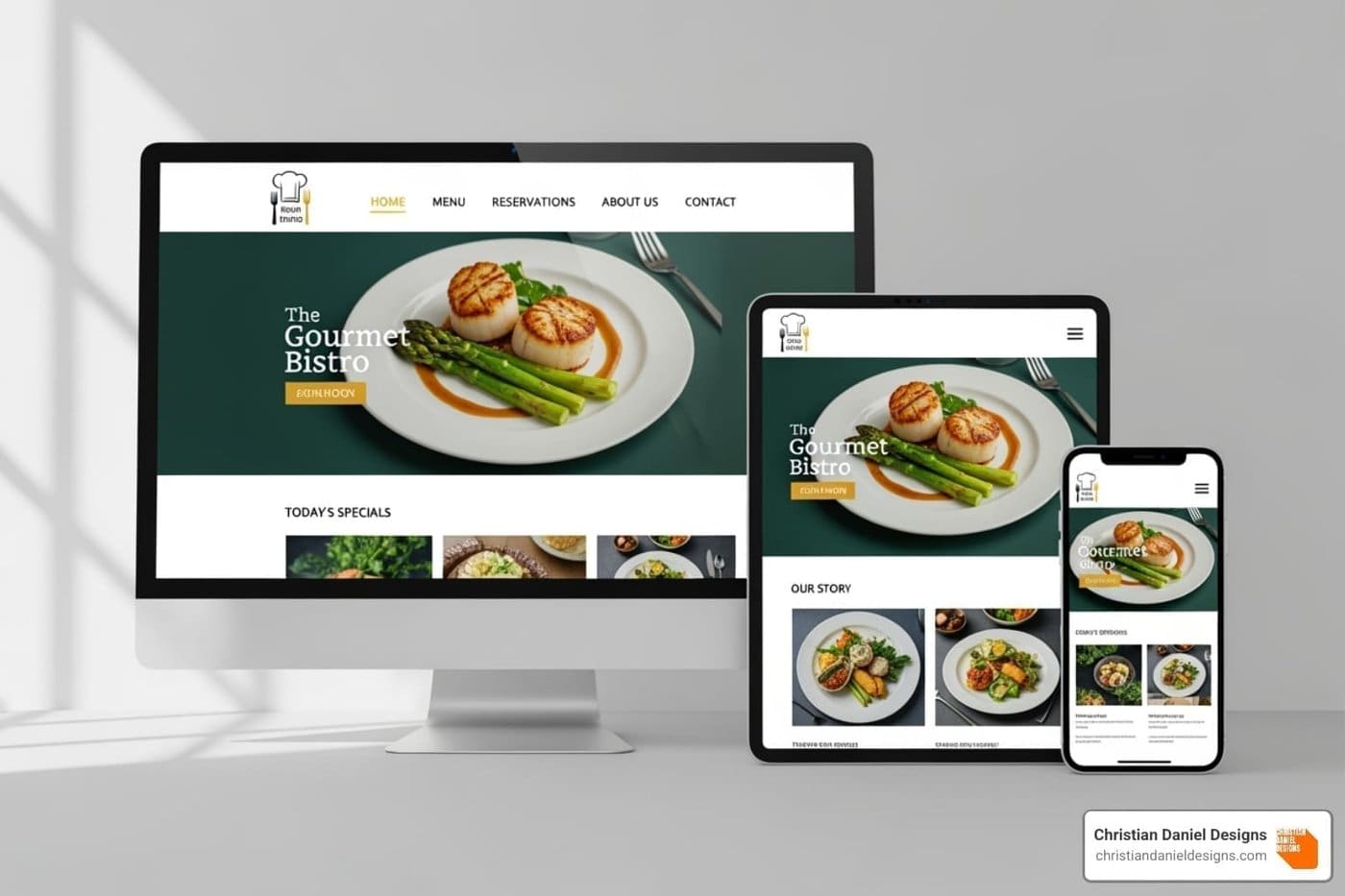
Responsive restaurant websites automatically adapt their layout to provide an optimal viewing experience on any device, from desktops to smartphones. This adaptability is essential for today’s restaurants.
Key Features of Responsive Restaurant Websites:
- Fluid layouts that adjust to any screen size
- Touch-friendly navigation optimized for mobile users
- Fast loading times across all devices
- Easy-to-read menus without zooming or scrolling
- One-click calling and directions for mobile users
- Seamless online ordering and reservation systems
The stakes are high: research shows 77% of diners visit a restaurant’s website before dining in or ordering takeout. With 80% of customers searching for restaurants online and 70% preferring to order online, your website is your most important first impression.
If a potential customer on their phone can’t easily read your menu, find your hours, or place an order, you’ve likely lost their business forever. Website speed is also critical. According to Portent, a site that loads in 1 second has a conversion rate three times higher than a site that takes 5 seconds to load. Faster websites don’t just create happier customers—they drive more business.
I’m Christian Daniel, founder of Christian Daniel Designs. For over two decades, I’ve helped hospitality businesses create digital experiences that drive real results. My work with responsive restaurant websites has helped clients like The Plaza Hotel and Park Hyatt Chicago transform their online presence into powerful revenue engines.

What is Responsive Design and Why is it Your Secret Ingredient?
Think of your website as your digital dining room—it should welcome everyone comfortably. Responsive restaurant websites do just that, automatically adjusting to fit perfectly on any screen, from a laptop at home to a phone on the go.
First introduced by Ethan Marcotte, this concept uses three key ingredients. Fluid grids allow content to stretch and shrink, flexible images resize without distortion, and media queries tell the layout how to rearrange itself for the device’s screen size.
On a desktop, customers might see a three-column menu with large photos. On a tablet, it might stack into two columns. On a smartphone, it becomes a single, easy-to-scroll column with large, readable text. This fluid adaptation shapes how customers perceive your brand. A smooth mobile experience signals professionalism and builds trust before they even walk through your door.
Why Responsive Restaurant Websites are a Must-Have
Over 60% of all website visits now happen on mobile devices. Your customers are looking you up on the go—while walking to lunch, comparing menus in traffic, or finding your number from their car.
When 80% of customers search online before visiting a restaurant, most of those searches are on phones. Google prioritizes mobile-friendly websites in local search results, meaning responsive design directly impacts your visibility and helps more customers find you.
A responsive site offers a competitive advantage. While others struggle with outdated sites, you can stand out with a beautiful experience on every device. It also future-proofs your investment, as a well-built responsive site will adapt to new devices automatically. For more insights, explore our Web Design expertise.
The Critical Role of Website Speed
We’ve all abandoned a slow-loading website out of hunger-fueled impatience. For restaurants, speed is the difference between gaining a customer and losing one. The numbers are stark: according to Portent, a website that loads within 1 second sees a three times higher conversion rate than a site that takes 5 seconds to load. Every second of delay could cost you two-thirds of your potential online business.
With 70% of consumers preferring to purchase food online, a slow site will send them straight to your competitors. The biggest culprit is often large, unoptimized images. Image optimization is crucial—compressing photos to ensure they look incredible while your site loads in a flash. The goal is to get customers from “hungry” to “ordering” in under a second. For more strategies, check out How to Attract Website Visitors.
The Core Ingredients of Effective Responsive Restaurant Websites
Building an effective responsive restaurant website is like crafting a perfect dish—every component must work in harmony. The best sites are built with a mobile-first approach, forcing a focus on what truly matters to customers on the go.

Your website must deliver an adaptable layout that feels natural on every device, with optimized media that loads quickly. Readable typography and touch-friendly navigation are essential for a smooth user experience. Most importantly, clear calls-to-action and easily accessible location and contact information should guide customers effortlessly.
Intuitive Navigation and User-Friendly Menus
Confusing online navigation is a recipe for lost customers. For restaurant sites, getting menus and navigation right is make-or-break. The hamburger menu (three horizontal lines) has become a mobile standard, tucking navigation away neatly. Paired with sticky navigation that stays visible as users scroll, it ensures key pages are always accessible.
Thumb-friendly design is critical. Buttons and links need to be large enough to tap easily, with ample spacing to prevent errors. Your font choices also matter; a script font that’s beautiful in print may be unreadable on a phone. Choose legible typography with high contrast for all screen sizes.
A common mistake is uploading PDF menus. They are terrible for mobile users, who are forced to pinch and zoom. Instead, use HTML menus built into your site. They adapt to any screen, are searchable, and improve your Google ranking. Finally, use high-quality food photography. Menus with photos can boost revenue by 30%, and great images sell the experience, just like at Gramercy Tavern.
Prominent Calls-to-Action (CTAs)
Guide your hungry visitors with prominent calls-to-action. Your “Order Now” button should be impossible to miss, especially since 70% of consumers prefer ordering online. An equally visible “Reserve a Table” form caters to the 60% of diners who prefer booking online.
Mobile users value convenience, so include click-to-call phone numbers and integrated maps that open directions with a single tap. Integrating online ordering and reservation systems directly into your site keeps customers engaged with your brand and provides you with valuable data. See how we’ve implemented this in our Online Food Marketplace Development.
Essential Information Front and Center
Answer every visitor’s key questions immediately: “Where are you?”, “When are you open?”, and “How do I get in touch?” Make this information impossible to miss.
Your phone number should be tappable to dial, and your address should link directly to maps. Hours of operation are often the first thing customers check. Social media links offer a way to build a deeper connection beyond a single meal.
Your About Us story transforms your restaurant from an option into a destination. Research shows 52% of visitors look for these pages to understand the story behind the business. Sharing your passion builds an emotional connection that creates loyal customers, as seen in our work with Swell Gelato.
Boosting Your Bottom Line: Conversions, SEO, and Brand Image
Let’s focus on what matters most: how a responsive website increases your restaurant’s revenue.
When your website works seamlessly on all devices, your online ordering conversion rates can soar. With 70% of consumers preferring to order food online, a fast, easy-to-use site is essential. A one-second load time can triple your conversion rate compared to a five-second one.
Reservation rates follow the same pattern. Since 60% of diners prefer booking online, a smooth mobile reservation process can dramatically increase bookings. A mobile-friendly site also builds brand consistency, acting as your digital dining room and reflecting the quality of your in-person experience. This consistency builds customer trust that lasts.

How Responsiveness Impacts SEO and Visibility
Google thinks like your customers: if your site frustrates mobile users, your search ranking will suffer. With Google’s mobile-first indexing, the search engine prioritizes your mobile site’s performance when ranking you. This is critical for restaurants, as 46% of Google searches have local intent.
When someone searches “best pizza near me,” Google rewards sites that work perfectly on their phone. A responsive design leads to reduced bounce rates, as visitors stay longer and interact more. These positive user signals tell Google your site is valuable, boosting your rank.
Responsive design also offers the single URL advantage. Unlike separate mobile sites (e.g., m.example.com), one URL concentrates all your SEO authority, making it easier for Google to rank you. For local restaurants, this can be the difference between being found and being forgotten. Our Restaurant Website Design expertise helps clients leverage these benefits.
One-Page vs. Multi-Page Responsive Designs
Should your restaurant have a one-page or multi-page website? Both can be effective when designed responsively, but the best choice depends on your needs.
One-page responsive websites are ideal for simplicity and a seamless mobile scrolling experience. They are often best for cafes or bistros with a straightforward story.
- Pros: Faster loading, immersive user experience, and often more cost-effective.
- Cons: Limited content depth and challenging for SEO, as you only have one page to optimize for all keywords.
Multi-page responsive websites provide more room for content and are better for SEO. This structure is suited for full-service restaurants with extensive menus, events, and services.
- Pros: Stronger SEO potential with dedicated pages, clearer user paths, and more scalable for growth.
- Cons: Require more complex navigation and typically have higher development and maintenance costs.
The key is to match the structure to your business. Either way, a responsive design is essential for turning visitors into customers.
From Kitchen Nightmares to Digital Dreams: Common Challenges & Solutions
Building a responsive site for a restaurant can present challenges, from technical glitches and design pitfalls to budget constraints. You might encounter slow servers, conflicting plugins, or the difficulty of keeping content updated across devices. However, these digital “kitchen nightmares” are all fixable.
Investing in a professional, responsive website is like buying an essential piece of kitchen equipment—the return comes through increased orders, reservations, and customer loyalty. While managing content and integrating third-party ordering or reservation systems can be complex, the right expertise makes it seamless.

Overcoming Common Challenges in Building Responsive Restaurant Websites
Here is a digital recipe for success to tackle common website challenges head-on.
Slow loading times kill conversions. The solution is image optimization, browser caching, and clean, efficient code to ensure your site runs smoothly.
Unreadable text frustrates users. Choose legible fonts with high contrast, and ensure text scales properly with generous line spacing for comfortable reading on any screen.
Non-clickable elements are a major mobile pain point. All buttons and links must be thumb-friendly—large enough to tap easily, with adequate spacing around them.
A complex online ordering process sends customers elsewhere. Streamline every step, use clear calls-to-action, and offer guest checkout to make ordering simple.
Maintaining your brand aesthetic across devices is crucial for a professional feel. A comprehensive style guide for colors, fonts, and imagery ensures consistency on every screen size.
Choosing the right platform depends on your needs. A simple bistro has different requirements than a multi-location restaurant. Find a solution that can grow with your business. We help clients find this balance, as seen in our Portfolio: Coffee Roaster Website 2.
By addressing these challenges, your responsive website becomes a powerful asset that works around the clock to grow your business.
Frequently Asked Questions about Responsive Restaurant Websites
As a web designer for hospitality brands like The Plaza Hotel and Park Hyatt Chicago, I often get questions from restaurant owners looking to upgrade their digital presence. Here are answers to the three most common ones.
How much does a responsive restaurant website cost?
The cost of a responsive restaurant website varies based on your needs. Basic template solutions can range from a few hundred to around $1,000 annually, including subscription and hosting fees. This is a good starting point for those comfortable with a DIY approach.
A custom-built site that reflects your unique brand and includes advanced features like integrated ordering, reservation systems, and professional photography typically ranges from $2,500 to $10,000 or more. The final cost depends on the project’s complexity.
Remember to budget for ongoing annual costs for your domain, hosting, and potential maintenance. A well-designed responsive site is an investment that pays for itself through increased conversions and online orders.
Can I make my existing restaurant website responsive?
Yes, in many cases, an existing site can be retrofitted to be responsive. The process begins with an audit of your current site’s structure and code to determine the best approach. We then implement a responsive strategy using fluid grids, flexible images, and CSS media queries to make your content adapt seamlessly to all devices.
After redesigning, we test thoroughly across dozens of devices and browsers to ensure a flawless experience everywhere. While sometimes an older site may benefit more from a complete rebuild, retrofitting is often a successful way to modernize your web presence while preserving your existing content.
What’s more important: a beautiful design or a fast website?
This is a classic dilemma, but the answer is you need both. However, speed comes first.
Think of website speed as your digital doorman. If your site is slow, customers will leave before they ever see your beautiful design. A site that loads in 1 second can achieve three times the conversion rate of a site that takes 5 seconds. Speed determines whether visitors stick around.
Once your site loads quickly, design becomes crucial. A stunning, intuitive design builds trust, reinforces your brand, and creates an emotional connection. With 60% of consumers more likely to choose restaurants with appealing photos, visual design clearly drives business.
The good news is you don’t have to choose. My approach to creating responsive restaurant sites is to deliver experiences that are both lightning-fast and visually captivating. Your restaurant deserves a website as impressive as your food.
Conclusion
Your website is no longer just a digital business card—it’s your restaurant’s hardest-working employee, greeting customers 24/7 and converting browsers into diners.
The takeaway is clear: with the vast majority of diners researching and ordering online, a mobile-first, responsive design is the foundation of your digital success. It improves SEO, boosts conversion rates, and builds a stronger, more consistent brand. Every broken layout or second of load time is a lost customer.
Choosing between a beautiful design and a fast website is a false choice. Your customers expect both. A stunning, lightning-fast responsive website for your restaurant builds trust and creates a crucial first impression that turns casual browsers into loyal regulars.
In today’s digital-first world, a responsive website isn’t just a feature—it’s the foundation of your restaurant’s online success. By prioritizing a mobile-first experience, you meet customers where they are and provide a seamless path from browsing to booking or ordering. For a custom, high-performance website that captures your brand’s essence and drives results, consider partnering with an expert. Christian Daniel Designs specializes in creating award-winning hotel and restaurant website designs that are as delightful as the dining experiences they represent.
Your restaurant’s digital change starts with a single click. Make sure it leads to an experience as memorable as your signature dish.
