Conversion-focused web design: Boost ROI in 2025
Why Your Website Needs to Convert Visitors into Customers
Conversion focused web design is a strategic approach that guides website visitors toward taking specific actions – like making a purchase, booking a service, or signing up for your newsletter. Unlike traditional web design that prioritizes aesthetics, conversion-focused design uses psychology-based techniques and user-centered methods to turn browsers into buyers.
Key Elements of Conversion-Focused Web Design:
- Single Clear Goal – Each page focuses on one primary action
- Strategic Visual Hierarchy – Important elements stand out through size, color, and placement
- Trust Signals – Customer reviews, testimonials, and security badges
- Friction Reduction – Simple forms, fast loading, mobile optimization
- Compelling CTAs – Action-oriented buttons that drive clicks
- Social Proof – Reviews and case studies that build credibility
This matters because visitors form an opinion about your website in 0.05 seconds, according to Forbes. If your site doesn’t immediately communicate value and guide users toward action, you’re losing potential customers before they even scroll.
The difference is dramatic. Businesses that switch from template sites to conversion-focused designs often see 63% higher engagement and conversion rate improvements of 32-94%. When done right, conversion-focused design transforms your website from a digital brochure into a 24/7 sales machine.
I’m Christian Daniel, and over the past two decades, I’ve helped hospitality and creative businesses achieve measurable growth through strategic conversion focused web design and video content. My approach combines visual storytelling with data-driven optimization to create websites that not only look great but deliver real business results.
The Core Principles of Conversion-Focused Web Design
Think of conversion focused web design as the difference between a wandering conversation and a clear story with a destination. At Christian Daniel Designs, two decades of work with hospitality and creative businesses have shown that effective design guides users to action, not just admiration.
The framework we use treats every element as purposeful:
Create Focus by eliminating distractions and defining one clear goal per page. Build Structure with logical organization and visual hierarchy that guides attention naturally. Stay Consistent with brand identity and user experience across all touchpoints. Show Benefits by clearly articulating your value proposition. Draw Attention using strategic visual cues like color and contrast. Design for Trust with social proof and credibility elements. Reduce Friction through streamlined user flows and optimized performance.
Let’s look at how these principles work in practice.
Create Focus and Clarity
Start by asking: “What’s the single most important thing we want visitors to do on this page?” The concept of attention ratio is key: one desired action should have one primary focus. Too many options cause analysis paralysis and kill conversions. Keep your value proposition unmistakably clear so visitors instantly know what you offer and why it matters to them.Build a Logical Structure
Users scan, they don’t read line-by-line. Information hierarchy and visual hierarchy create a roadmap for the eye. Eye-tracking research shows two dominant patterns: the F-Pattern on content-heavy pages and the Z-Pattern on conversion-focused layouts. Understanding how people read on the web according to eye-tracking studies helps place key elements where they’ll be seen.
Before designing visuals, we wireframe. Wireframes define what goes where, how much space elements need, and the ideal flow. This ensures the story is told in the right order and that information is easy to find.Maintain Consistency
Trust grows from consistency. The ad-to-page scent—visual and messaging alignment between marketing and landing pages—must be unmistakable. We follow your brand guidelines across typography, color, imagery, and tone. Beyond visuals, we create a consistent experience so visitors can steer confidently without relearning patterns on each page.
Reduce Friction for a Smooth User Experience
Friction is anything that slows or confuses users. Page speed is often the biggest culprit, so speed performance optimization is a priority. Use simple forms and only request what’s necessary. Mobile optimization is essential—research from Google shows mobile users are even less patient. Anticipate sticking points and remove them so conversion feels effortless.
Key Strategies to Guide Users and Drive Action
Once the core principles are in place, smart psychology and persuasive design nudge visitors toward action without being pushy.
Leverage Visual Cues and Layout
Our brains process visuals faster than text, so design must signal what’s important at a glance.
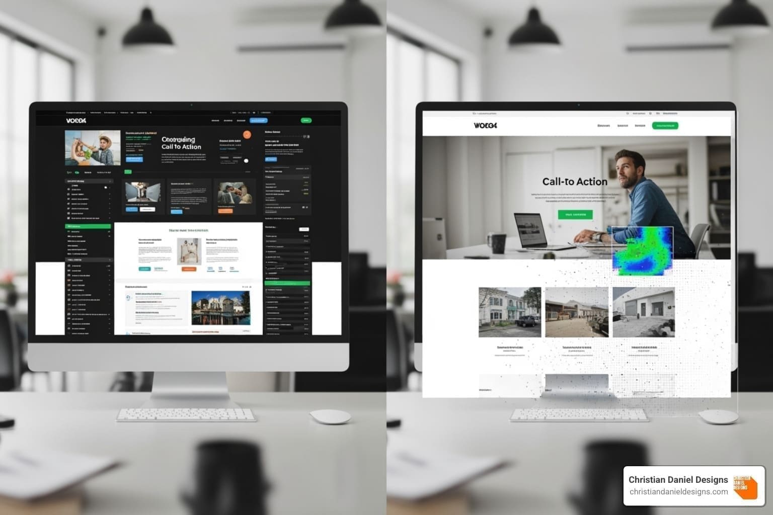
Encapsulation frames critical elements (like benefits or CTAs) with contrasting sections or borders to spotlight them. Color and contrast act like visual magnets; reserving one bold color for the primary CTA makes it stand out. Directional cues—arrows, angled elements, or a subject in a photo looking toward your CTA—subtly guide attention. Negative space isn’t empty; it’s breathing room that boosts clarity. Choose a hero shot that conveys real benefits. Avoid generic stock photos—most users simply ignore them.
Build Trust with Social Proof and Credibility
People look to others when making decisions. Use testimonials with real names, photos, and roles. The data is clear: up to 98% of consumers depend on customer reviews when shopping online, according to Harvard Business Review. Place reviews and star ratings throughout pages and link to third-party platforms. Add trust badges (SSL, payment processors, awards, media mentions), especially near checkout. For services, case studies showing the problem, approach, and measurable results are powerful—see our Med Spa Website portfolio.
Create Urgency and Incentive
A gentle push helps visitors act now instead of “later.” Scarcity works via Loss Aversion (limited spots or inventory). Limited-time offers and countdowns add a clear deadline. Free trials or consultations reduce perceived risk. Always keep urgency authentic.
Design High-Converting Call-to-Action (CTA) Buttons
Your CTA is the moment of truth. Place CTAs above the fold and near natural decision points. Use benefit-driven button copy like “Get My Free Quote,” “Start Your Free Trial,” or “Book Your Consultation Now.” Ensure strong color contrast, ample size and padding (especially on mobile), and add subtle hover effects for feedback. When placement, copy, and styling align, clicks follow.
How to Implement and Measure Your Success
A successful conversion focused web design isn’t “set and forget.” You launch, learn from real users, and iterate based on data.
Practical Steps for Your Conversion-Focused Web Design Strategy
- Do user research and persona development to uncover goals, objections, and content preferences.
- Map the user journey and wireframe flows before visuals to remove friction early.
- Run A/B tests on headlines, layouts, and CTAs; let data decide design debates.
- Use heatmaps and session recordings to spot confusion, dead clicks, or ignored content.
- Integrate SEO from the start so you attract the right traffic and convert it.
Measuring Effectiveness: Key Metrics to Track
- Conversion rate: the north star. Small lifts compound quickly.
- Bounce rate: signals first-impression issues (speed, relevance, clutter).
- Click-through rate (CTR) on CTAs: reveals which messages and buttons earn attention.
- Average session duration: a proxy for engagement, especially on complex offers.
- Cart abandonment rate (e-commerce): highlights checkout friction.
Track consistently, iterate purposefully, and compound gains over time—similar to how we measure video marketing ROI.
Frequently Asked Questions about Conversion Design
What is Conversion-Focused Web Design and Why Does it Matter?
Conversion focused web design blends psychology, UX, and data to guide visitors toward a clear action—purchase, booking, or signup—so your site operates like a 24/7 sales tool. It maximizes the value of every visit and helps you get a higher ROI from your paid marketing campaigns.
How Does it Differ from Standard Web Design?
It’s about intentionality. Standard design serves many purposes; conversion-focused design prioritizes one clear goal per page and removes distractions. Think of a broad homepage vs. a targeted landing page built to convert a specific audience from a specific campaign. Our website design services balance aesthetics with strategy, but when conversion is the priority, every decision supports that single outcome.
When is a Conversion-Centered Approach Most Effective?
It shines on landing pages, paid ad campaigns, lead-generation offers, and e-commerce checkouts where a single action matters. It’s less suited for sites designed primarily for exploration, like news, educational resources, or complex corporate homepages serving multiple audiences simultaneously.
Conclusion
Your website has the potential to be so much more than a pretty digital business card. With conversion focused web design, you’re not just creating an online presence – you’re building a strategic tool that works around the clock to grow your business.
Think about it: every visitor who lands on your site is already interested enough to check you out. The question is, will they take the next step? By applying the principles we’ve covered – creating laser focus, building logical structure, maintaining consistency, and removing every possible barrier – you’re setting up each visitor for success.
The strategies we’ve explored aren’t just theory. When you leverage visual cues to guide the eye, build trust through authentic social proof, and create that gentle sense of urgency, you’re tapping into fundamental human psychology. You’re making it easier for people to say “yes” to what you’re offering.
At Christian Daniel Designs, I’ve spent over two decades perfecting this balance between beautiful design and business results. Working with small businesses and hospitality brands here in NYC, I’ve seen how the right approach can transform a website from a digital afterthought into a powerful growth engine.
The beauty of conversion focused web design lies in its measurability. You’re not guessing whether your website is working – you can see it in your analytics, your lead generation, and ultimately, your bottom line. Every element has a purpose, and every improvement can be tracked and optimized.
Your visitors are giving you their most precious resource – their time and attention. By implementing these conversion-focused principles, you’re respecting that gift and making sure it benefits both of you. They get the solution they’re looking for, and you get the business growth you deserve.
Ready to see what conversion focused web design can do for your business? Explore our portfolio to see how we’ve designed high-converting websites for hospitality brands and find how we can transform your digital presence into your most valuable business asset.

